25 Dorm Room Color Schemes That Actually Work in a 150-Square-Foot Box
My freshman-year dorm had beige cinderblock walls, a fluorescent overhead light that made everyone look slightly ill, and a floor tile pattern that I can only describe as “institutional speckle.”
I made it worse before I made it better: I bought a teal comforter, pink pillows, a yellow rug, and grey curtains because I liked each piece individually. The result looked like a preschool had exploded, and I lived with it until Thanksgiving.
Sophomore year, I cracked the code. Pick two or three colors, repeat them everywhere, and let the biggest surfaces do the heavy lifting.
That’s the whole philosophy behind these 25 dorm room color schemes — they’re built for small spaces, rental rules, and the reality that your bed is also your couch, your desk is also your dining table, and your walls are probably cinderblock.
Below, I’ve grouped the schemes by mood, included the real cost of pulling each one off, and flagged the ones that are genuinely renter-friendly versus the ones that will cost you a damage fee at move-out.
I’ve also included the 60-30-10 formula that makes all of them work, because once you understand that, you can break every rule on this list and still end up with a room that looks intentional.
The 60-30-10 Rule (Read This Before You Buy Anything)
Every scheme on this list follows the same underlying math: roughly 60 percent of the room in a neutral base, 30 percent in your chosen color, and 10 percent in an accent . In a dorm, that usually means 60 percent bedding and walls, 30 percent rug and curtains, and 10 percent pillows, art, and small decor.
The reason this matters more in a dorm than in a regular bedroom is that dorms are small and visually loud by default. Cinderblock texture, fluorescent lighting, and furniture you didn’t choose are all competing for attention. A tight palette gives the room a point of view and stops it from feeling like a collection of unrelated dorm essentials .
Pro tip: Before you buy a single thing, write down three words for how you want the room to feel — “calm and airy,” “warm and grounded,” “soft and romantic,” whatever. Use those words as a filter. If an item doesn’t support at least one of them or solve a real problem, it’s probably visual noise .
Warm & Neutral Dorm Room Color Schemes
These are the schemes I’d recommend to anyone who wants a room that feels calm, photographs well, and doesn’t get old by October. They’re also the most forgiving if you’re coordinating with a roommate, because neutrals play nicely with almost anything.
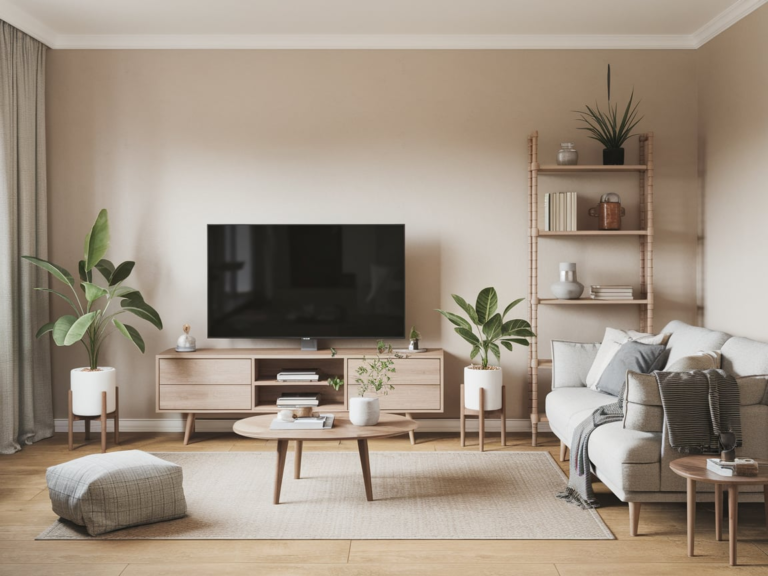
1. Soft Neutrals: Warm Beige, Cream, and Taupe
Why it works: A warm neutral base makes a small room feel bigger and brighter without feeling sterile . It’s the safest starting point if you’re overwhelmed by options, and it’s the easiest palette to add personality to later through art and textiles.
How to do it: Use warm beige or cream as your 60 percent — bedding, curtains, a large rug. Layer light grey or taupe through pillows and desk accessories. Add creamy white in storage bins and a soft throw. The budget for a complete makeover runs about $50 to $150 .
The trade-off: Neutrals show stains. If you’re someone who eats at their desk or drinks coffee in bed, a cream comforter is a commitment. A washable duvet cover is non-negotiable here.
2. Monochrome Sage: One Color, Many Textures
Why it works: Monochrome doesn’t mean boring. By picking one color family — sage green works especially well in dorms — and varying the shades and textures, you create depth without competing hues . It reads sophisticated in photos and hides everyday clutter better than a high-contrast palette.
How to do it: Pick sage in three to four shades: light for sheets, medium for the duvet, dark for a throw blanket or accent pillow. Vary textures — smooth cotton, nubby knit, a little metal in a desk lamp — so the room doesn’t look flat. Budget: $60 to $120 .
The trade-off: Monochrome can tip into matchy-matchy if you’re not careful. The fix is texture: a ribbed throw, a linen duvet, and a woven rug in the same color family read intentional, not accidental.
3. Scandinavian Simplicity: White + Natural Wood
Why it works: White reflects light, which is the closest thing to a free square-footage upgrade in a dorm. Natural wood warms it up so the room doesn’t feel like a hospital . This is the palette I’d pick for a north-facing room with limited window light.
How to do it: White bedding and curtains for maximum light reflection, natural wood tones through a desk organizer, a small shelf, or a mirror frame, and soft cream in a throw or rug. Budget: $40 to $100 .
The trade-off: All-white bedding in a dorm laundry room is a gamble. One accidental red sock and your sheets are pink forever. I’d go with an off-white or cream duvet and keep the pure white for curtains and desk accessories.
Pro tip: If you’re doing a neutral scheme, spend your money on the rug and the lighting, not the wall art. A $70 rug and a $25 warm desk lamp will do more for the room than $70 of prints, because the rug anchors the space and the lighting fixes the fluorescent overhead situation .
4. Oatmeal, Clay, and Washed Denim
Why it works: This one is warm, casual, and grounded — the dorm equivalent of your favorite broken-in jeans . It’s a good middle ground if you want color but don’t want pink, green, or blue to be the whole personality of the room.
How to do it: Start with oatmeal or natural ivory sheets, add a clay-colored duvet cover, and bring in washed denim through a throw pillow or a small rug. The clay adds warmth without going orange, and the denim keeps it from feeling too precious.
The trade-off: Clay and terracotta can read “Southwestern” if you lean too hard into them. Keep the ratio heavy on oatmeal and light on clay, and skip any pattern that looks like a sunset.
5. Warm White and Rattan (Boho Lite)
Why it works: The “coastal, boho, and beach” trends were three of the top dorm styles for back-to-school 2026, and warm white plus rattan is the most wearable version of that . It feels like a vacation without looking like a themed hotel room.
How to do it: Warm white bedding as your base, a rattan or woven basket for storage, a jute rug if your budget allows, and one or two green plants (real or fake). Budget: $200 to $400 if you’re starting fresh, or $100 to $200 for a refresh .
The trade-off: Rattan and jute are textured, which is great for warmth but terrible for dust. If you have allergies, a flatweave cotton rug is the safer choice.
Cool & Calm Dorm Room Color Schemes
These schemes lean blue, green, and grey — the colors that tend to make a small room feel quieter and more spacious. They’re also the ones that look best under the cool-toned overhead lighting most dorms come with.
6. Coastal Blue & Cream
Why it works: Light blue and cream is the classic small-space palette for a reason: it’s bright, airy, and reads clean even when the room isn’t . Google search data showed blue as one of the top three dorm colors for 2026, and coastal was one of the top three dorm styles .
How to do it: Start with a light blue comforter or duvet, add white or cream sheets and pillows, and mix in a slightly deeper blue throw or a textured beige blanket . Keep the walls (if you can cover them) in a blue-and-cream peel-and-stick wallpaper or skip the walls entirely and let the bedding carry the palette.
The trade-off: Coastal can go “beach house rental” if you add too many shells and anchors. Keep the palette tight and skip the literal beach decor.
7. Navy and Warm Mustard
Why it works: Navy is a grounding color that makes a room feel more grown-up than it probably is, and mustard adds warmth without going red . It’s the scheme I’d pick if you want something that feels a little more designed than the average dorm.
How to do it: Navy bedding or a navy throw as the 30 percent, warm mustard in pillows or a small lamp, and a neutral base in cream or oatmeal. If you’re worried about the room feeling dark, keep the mustard in a small accent and use a warm white bulb in your desk lamp.
The trade-off: Navy shows lint and pet hair (if you sneak a cat in). A lint roller in your desk drawer solves 90 percent of the problem.
8. Pink and Grey: Blush, Dusty Rose, and Charcoal
Why it works: Pink and grey is one of the most reliable color combinations for small spaces because the grey keeps the pink from feeling too sweet, and the pink keeps the grey from feeling too cold . The most successful versions pair soft blush or dusty rose with light-to-charcoal grey foundations.
How to do it: Grey bedding as your 60 percent, blush pink pillows and a throw as your 30 percent, and a small metallic or black accent as your 10 percent. A grey rug and pink curtains tie it together without overwhelming the room.
The trade-off: Too much pink and grey can read “2014 millennial apartment.” The 2026 version works because the pink is dusty and the grey has warmth to it — avoid cool, blue-toned greys and hot pink.
9. Sage Green and Light Grey
Why it works: Sage green was one of the dominant dorm colors on Pinterest and TikTok for 2026, often paired with light grey and white . It’s calm, it’s gender-neutral, and it works with almost any wood tone you’re stuck with.
How to do it: Sage green duvet or comforter, light grey sheets or a grey throw, and white or cream pillows. Add a deeper sage or olive in a small accent — a plant pot, a lamp base, a picture frame — so the palette has some depth .
The trade-off: Sage is everywhere right now, which means it might feel dated by junior year. If you’re worried about that, use sage as the accent (pillows, art) and keep the bedding in a neutral you can live with longer.
10. Cool Grey and Icy Blue
Why it works: Cool grey with an icy blue undertone mimics overcast skies and frosty mornings, which is a surprisingly calming brief for a dorm . It’s the scheme I’d pick for a room that gets too much afternoon sun and needs to feel cooler.
How to do it: Medium grey bedding, icy blue pillows, and a white or cream base. Avoid pale grey — it reads like primer — and go for a grey with visible depth. A chrome or silver lamp adds a cool metallic accent that fits the palette.
The trade-off: Cool-toned rooms can feel sterile if there’s no texture. A chunky knit throw or a sheepskin rug in cream breaks up the grey and makes it feel lived-in.
Pro tip: Dorm rooms often have cool overhead lighting that makes warm colors look muddy and cool colors look sharper. If your palette leans blue or grey, buy a warm-white bulb for your desk lamp — it costs about $5 and fixes the whole room .
Bold & Moody Dorm Room Color Schemes
If you’re the kind of person who wants their room to have a personality, these are the schemes that do the most work. They’re also the ones that require the most discipline, because bold palettes fall apart fast if you add one too many accents.
11. Deep Green: Forest, Olive, or Emerald
Why it works: Dark green as a main color — not just an accent — makes a small dorm feel cozy and sophisticated rather than cramped . It’s one of the few dark colors that works in a small space without making it feel like a cave, especially if you keep the bedding and curtains light.
How to do it: Forest green or deep olive comforter, white or cream sheets, and a lighter green or mustard accent. If you’re doing a dark green mood, commit to it — a forest green duvet with beige walls and wood tones reads intentional .
The trade-off: Dark bedding shows every piece of lint and every crumb. If you’re not willing to lint-roll regularly, pick a medium olive instead of a deep forest green.
12. Black and Cream (High Contrast)
Why it works: Black and cream is the dorm palette equivalent of a well-cut blazer — it makes everything look more expensive than it is. It’s also remarkably forgiving of mismatched furniture, because the contrast gives the eye something to focus on besides the plastic bed frame.
How to do it: Cream bedding as the 60 percent, black in a throw blanket or pillow, and a small metallic accent (brass or gold) as the 10 percent. Keep the black concentrated in one or two places so it reads deliberate, not accidental.
The trade-off: Black shows dust. A black throw blanket will be covered in fuzz within a week. A black lamp or picture frame is lower-maintenance.
13. Oxblood and Blush
Why it works: Oxblood — a deep, brownish red — is one of the 2026 accent colors that interior designers keep coming back to because it adds richness without feeling loud . Paired with blush pink, it’s moody but still soft.
How to do it: Blush bedding as your base, oxblood in a throw or a pillow, and cream or oatmeal as the neutral. This is a scheme that works best in a room with warm lighting — if your dorm has cool fluorescents, the oxblood can look brown.
The trade-off: Oxblood is a commitment color. If you get tired of it, you’re replacing the most visible thing in the room. Start with an oxblood pillow or throw before you commit to a duvet.
14. Chocolate Brown and Soft Pink
Why it works: The “10% pink” rule that circulated in 2026 design circles suggests using pink as a neutral and pairing it with earthy materials and deep woods . Chocolate brown and dusty pink is the most wearable version of that idea for a dorm.
How to do it: Chocolate brown or warm taupe bedding, dusty pink pillows, and cream sheets. A light wood or rattan accent keeps the brown from feeling heavy .
The trade-off: Brown and pink can read “2005 bedroom” if the pink is too bright. Go dusty, go muted, and keep the brown on the warmer side.
15. Slate Blue and Rust
Why it works: Slate blue and rust is a classic complementary pairing that feels more interesting than navy and mustard but is just as easy to pull off. The blue cools the room down; the rust warms it back up.
How to do it: Slate blue bedding, rust in a throw or a pillow, and a cream or oatmeal base. If you want to push it further, add a small amount of deep green or brass for a third accent.
The trade-off: Rust is a trend color, and trend colors have a shorter shelf life than neutrals. If you’re on a tight budget and want a scheme that lasts all four years, keep rust in the pillows and art rather than the comforter.
Pro tip: Dark and saturated colors show texture more than light colors, which is good news for cheap bedding. A $40 dark green comforter looks more expensive than a $40 beige one because the color gives it depth. Spend your money on the neutral pieces you’ll keep, and go budget on the bold accents .
Pastel & Playful Dorm Room Color Schemes
These schemes are for the people who want their room to feel like a mood board — soft, bright, and a little bit extra. They’re also the easiest to coordinate with a roommate, because pastels are forgiving when two people have different tastes.
16. Lavender and Soft Grey
Why it works: Lavender is calming without being boring, and it pairs beautifully with grey because the grey gives it somewhere to land . It’s a good pick if you want pink but want something slightly less expected.
How to do it: Lavender duvet or comforter, soft grey sheets or a grey throw, and white or cream pillows. A peel-and-stick wallpaper in a subtle mauve or lavender pattern can carry the palette on the walls without paint . Budget-friendly lavender duvet covers are widely available, and the rest of the scheme can come from what you already own .
The trade-off: Lavender can read “little girl’s room” if you pair it with too many ruffles and florals. Keep the lines clean and the textures simple.
17. Peach and Sage
Why it works: Peach and sage is warm and soft without being cloying, and it works in a dorm because both colors are muted enough to live together in a small space. It’s also a scheme that looks good under warm or cool lighting, which is more than I can say for most pastels.
How to do it: Sage green bedding as your base, peach in pillows or a throw, and cream as the neutral. If you want to add a third color, a small amount of terracotta ties the peach and sage together.
The trade-off: Peach is hard to get right in artificial light — it can look orange or pink depending on the bulb. Buy a peach pillow first and see how it looks in your room before you commit to a duvet.
18. Lilac and Butter Yellow
Why it works: Lilac and butter yellow is the pastel pairing that feels the most 2026 — soft, slightly retro, and genuinely cheerful without being loud. It’s the scheme I’d pick if you want a room that feels like a sunny day.
How to do it: Lilac bedding or a lilac throw, butter yellow pillows, and a white or cream base. Keep the yellow in small doses — a lamp, a picture frame, a single pillow — so it reads as an accent rather than a theme.
The trade-off: Yellow and lilac can clash if the undertones are wrong. Go for a butter yellow with warm undertones and a lilac with a cool, slightly grey base.
19. Dusty Rose and Olive
Why it works: Dusty rose and olive is the earthy version of pink and green, and it’s more sophisticated than the brighter preppy combinations . The olive grounds the pink, and the pink keeps the olive from feeling drab.
How to do it: Dusty rose bedding, olive green pillows or a throw, and oatmeal or cream sheets. A botanical print in a pink frame ties the two colors together without adding a third .
The trade-off: Olive can look muddy in a room with poor lighting. If your dorm gets very little natural light, use olive as a small accent and keep the bedding in a lighter neutral.
20. Pastel Pink and Mint Green
Why it works: This is the “retro floral / Y2K” version of pink and green — playful, youthful, and checkered if you want it to be . It’s not for everyone, but if you want a room that feels fun and a little bit camp, this is the scheme that delivers.
How to do it: Pastel pink bedding, mint green pillows or a throw, and white as the neutral. If you want to lean into the retro vibe, a checkered or gingham pattern in one of the two colors does the work for you.
The trade-off: This scheme has the shortest trend life of anything on this list. If you’re not willing to redecorate in a year, keep the pastels in the pillows and not the comforter.
Pro tip: Pastels are the hardest colors to shop for online because screen calibration lies. Buy one pillow or one throw in the shade you think you want, live with it for a week, and then commit to the bigger pieces. A $15 mistake is easier to swallow than a $60 one.
Earthy & Grounded Dorm Room Color Schemes
These schemes lean into terracotta, clay, olive, and brown — the colors that make a dorm feel like a real bedroom instead of a temporary holding cell. They’re also the ones that hide wear and tear the best.
21. Terracotta and Cream
Why it works: Terracotta adds warmth to a dorm without the heaviness of red, and cream keeps it from feeling like a desert-themed restaurant . It’s a good palette if you want color but don’t want to commit to a “color color.”
How to do it: Cream bedding as your base, terracotta in a duvet or a throw, and a small amount of deep brown or olive as the accent. A jute or natural fiber rug ties the earth tones together.
The trade-off: Terracotta can read “Southwestern” very quickly if you add too many patterns. Keep the patterns minimal and let the color do the work.
22. Forest Green and Brass
Why it works: Forest green and brass is the most “grown-up” scheme on this list. It’s the palette of old libraries and boutique hotels, and it makes a dorm feel like a place where someone has their life together .
How to do it: Forest green bedding or a forest green throw, brass or gold in a lamp, a mirror frame, or drawer pulls, and cream or oatmeal as the neutral. If you can’t change the drawer pulls, a brass desk lamp and a brass picture frame do the same job.
The trade-off: Brass can look cheap if it’s too shiny. Go for an antique or brushed brass finish rather than a bright polished gold.
23. Slate Blue and Oatmeal
Why it works: Slate blue is calmer than navy and warmer than grey, which makes it one of the most versatile colors for a dorm . Oatmeal keeps it from feeling too cool, and the combination works in almost any lighting.
How to do it: Slate blue bedding, oatmeal or cream sheets and pillows, and a natural wood or rattan accent. A light grey or oatmeal rug grounds the palette without competing with the blue.
The trade-off: Slate blue can look grey in photos, which means your room might not “read” as blue in the way you expected. If you want a clearer blue, go one shade more saturated than you think you need.
24. Grayscale + One Metallic
Why it works: A grey-on-grey palette with one metallic accent — silver, chrome, or brushed nickel — is the easiest way to make a dorm look modern and intentional without picking a “color” at all . It’s also the most roommate-friendly scheme on this list, because grey goes with everything.
How to do it: Charcoal grey bedding, light grey throw, medium grey desk lamp, and silver or chrome picture frames . Keep the greys in different shades so the room has depth rather than looking like a fog.
The trade-off: Greyscale can feel cold if there’s no texture. A chunky knit throw, a sheepskin rug, or a linen duvet in a warm grey breaks up the flatness.
25. Cherry Red and Cream (The Bold Accent)
Why it works: If you want one color that does all the work, cherry red and cream is the scheme. Red is the most visible color in a small space, which means a single red throw or a red duvet is enough to make the whole room feel designed.
How to do it: Cream bedding as the base, cherry red in one major piece — a duvet, a throw, or a rug — and a small amount of black or brass as the accent. Don’t add a second bold color; let the red be the moment.
The trade-off: Red is the hardest color to photograph and the easiest to get tired of. If you’re not sure, start with a red pillow and see how you feel after a month.
Pro tip: Earthy palettes hide dorm wear and tear better than any other color family. Terracotta, olive, and oatmeal don’t show the same scuffs, dust, and mystery stains that white and pale grey do. If you’re hard on your space, lean earthy .
Comparison Table: Which Dorm Room Color Scheme Fits Your Budget?
The scheme you pick should depend as much on your budget as your taste. Here’s how the main categories break down in real 2026 numbers:
The underlying numbers: Twin XL sheets run $16 to $45, a Twin XL comforter set runs $38 to $45, a dorm-ready rug runs $50 to $170, and fairy lights run $7 to $19 . Peel-and-stick wallpaper is $28 to $35 per roll, and you’ll typically need two to three rolls for an accent wall .
If you’re starting from nothing and want a full setup — bedding, rug, lighting, storage — plan for $180 to $300 for a solid, complete Twin XL bedding setup alone . The good news is that the color scheme itself is the cheapest part of the equation, because it’s mostly about what you choose, not what you spend.
What I’d Do First If I Were Starting Over
If I were moving into a dorm next month and had $200 to spend, I’d pick one of two schemes: soft neutrals with a sage accent, or coastal blue and cream. Both are forgiving of mismatched furniture, both work under bad lighting, and both leave room for you to add personality later without repainting or re-buying everything.
I’d spend the most on bedding — a Twin XL set in a neutral I actually like — and a rug that’s big enough to fit the front legs of the bed. I’d buy a $7 string of fairy lights and a $15 warm-white desk lamp before I bought a single piece of wall art, because lighting changes the room more than decor does. And I’d leave the walls blank for the first two weeks, because you don’t know what a room needs until you’ve lived in it.
The mistake I made for years was treating the color scheme as the last decision instead of the first. Pick the palette, then buy the things. It’s the difference between a room that looks like a yard sale and a room that looks like you.
FAQs
What is the best color scheme for a small dorm room?
Light neutrals and cool tones — whites, creams, soft greys, light blues, and sage greens — make a small room feel larger and brighter . But the “best” scheme is the one you can live with for a full school year. If you love dark colors, use them as accents rather than the base, and keep the bedding and curtains light.
How do I coordinate a dorm color scheme with a roommate?
Pick one neutral that you both like — cream, white, or light grey — and let each person choose one accent color. Use the neutral for the shared pieces (rug, curtains, maybe a small lamp) and keep the accents in personal zones (your side of the room, your bedding, your desk). Talk about the palette before either of you buys anything .
Can I use peel-and-stick wallpaper in a dorm?
Usually, yes, but check your housing rules first. Peel-and-stick wallpaper is the highest-impact, lowest-risk rental upgrade because it requires no paste and removes without damage if the wall paint is sound . NuWallpaper runs about $28 to $35 per roll, and you’ll need two to three rolls for a typical accent wall . Always patch-test a small area before committing.
How do I hang things on dorm walls without nails?
Command strips and picture-hanging strips are the standard solution for dorms and rentals. They hold strongly on painted walls, finished wood, glass, tile, and metal, and they remove cleanly without holes or sticky residue . For heavier frames, use the XL picture-hanging strips rated for up to 7.2 kg . Washi tape and lightweight tapestries are good backups for things that are too light for strips or too awkward for hooks.
What bedding size do I need for a dorm?
Most U.S. dorms use Twin XL mattresses, which are 5 inches longer than a standard twin. A standard twin comforter will run several inches short and leave a bare strip at the foot of the bed . Twin XL sheet sets run $16 to $45 depending on the brand and material, and a full Twin XL bedding setup — sheets, topper, comforter, and pillow — usually lands between $120 and $300 .
How much should I budget for dorm room decor?
A realistic full setup — bedding, rug, lighting, storage, and a few decor pieces — runs $100 to $400 depending on how much you’re starting with and how much you’re willing to thrift . You can decorate a dorm for $80 if you’re strategic (neutral bedding, a cheap rug, Dollar Tree storage, printed art), and it will still look good in photos . The color scheme is the cheapest part — it’s the bedding and rug that eat the budget.